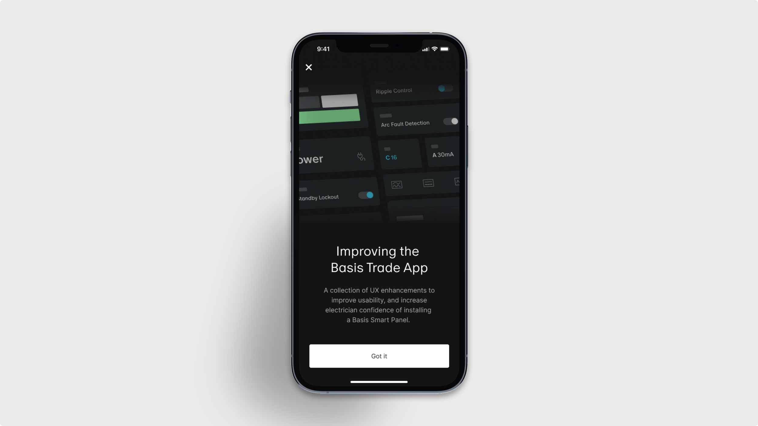
Improving the Trade App
A collection of targeted UX enhancements to improve usability, reduce install friction, and increase the electrician's confidence in installing a Basis Smart Panel.
Lead Product Designer · 2024 - 2025
How might we reduce friction & increase confidence for electricians configuring Smart Panels in the field?
-
I led the design of these selected features of the Basis Trade App, the sole product for configuring and installing our Smart Panel in the field. As the only Product Designer on the Trade App team, I shaped the MVP and evolving vision, working closely with engineers, product, and embedded electricians to enable sparkies (electricians) to complete installs confidently and independently.
-
The Trade App is the only tool sparkies use to install and configure our Smart Panel. As our product reached more testing, we saw recurring pain points: confusing flows, unclear feedback, and inconsistent patterns that slowed installs or triggered support. We set out to reduce complexity, support sparkies of different training levels, and improve success rates by making the app more intuitive, trustworthy, and scalable.
-
Leading series of UX improvements across key workflow. Each focused on building clarity, predictability, and confidence. These changes were designed and shipped incrementally, but unified by a core goal: to help sparkies complete installs smoothly with less friction and more trust in our product and their new workflow.
-
I led the end-to-end design process from user research and feature prioritisation to prototyping, testing, and handoff.
My work spanned UX strategy, interaction and interface design, information architecture, and design systems.
I also shaped the app’s long-term vision by mapping future-state flows and collaborating closely with product, engineering, and hardware teams to ensure solutions met panel and installation needs and feasibility.
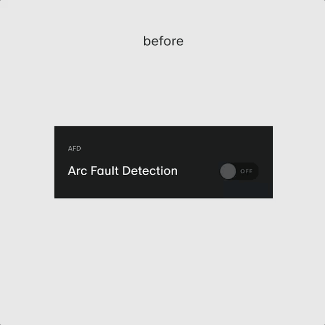
Smarter, simpler configuration controls
The toggles were inconsistently placed, lacked clear descriptions, introduced cognitive overload, didn’t align with best practice and were sometimes unintuitive for sparkies to understand or use confidently. With technical constraints, these are the iterations of improvements made.
Improvements made
Refined toggle layout and grouping based on best practices
Created new component and consistent interaction pattern for Design System
Improved toggle defaults to reduce setup errors
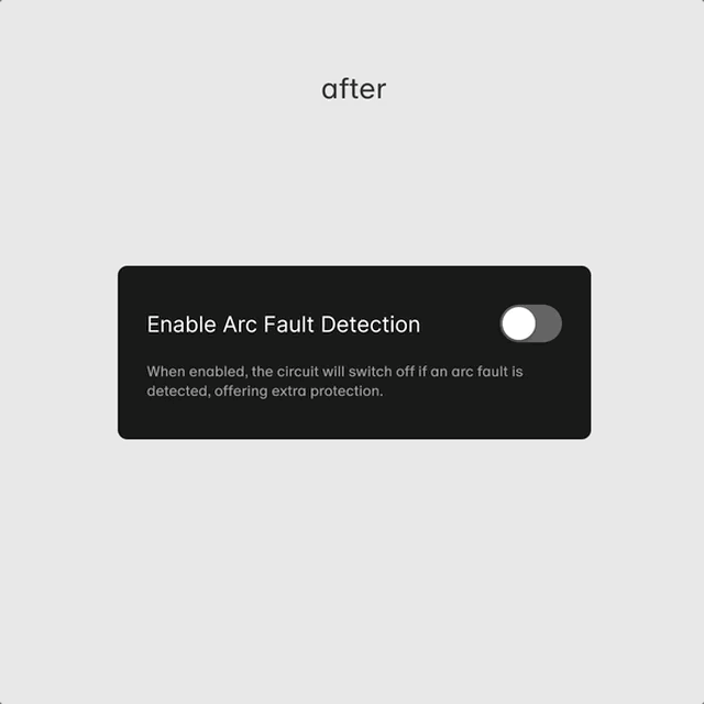
Impact
Clearer affordances and reduced setup time
Improved confidence for sparkies
Reduced customer support tickets
Set a scalable pattern and component used in future toggle-based controls
Reduce dev implementation and respect platform native components
Improved Panel reconnection
When connection to a panel was lost, the recovery flow was overly complex and not scalable. Users faced multiple confusing UI states, and reconnection required extensive back-end UI locking.
Connection can be lost if out of range from the Smart Panel, so it was critical to ensure a seamless reconnection and be able to pick up where they left off.
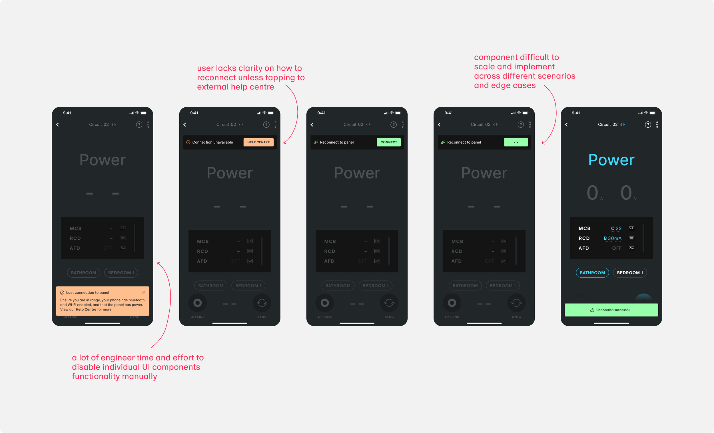
Outcome
I redesigned the reconnection pattern to be more visible, intuitive, and scalable, adapting to any screen without deep conditional logic.
Key Improvements
Preventing the error from escalating
Reduced to one-tap interaction to recover
Feedback for user throughout the process

Impact
Reduced dev effort to implement across screens, flows and edge cases
Increased success rate in user reconnections
More awareness and user control during recovery
Faster reconnection time and get back to task
Securing Panel Access
Previously, any user could connect to any nearby panel with no additional verification, posing a risk for unauthorised or accidental configuration access.
Old Flow Summary
Tap to connect > direct access to Site Dashboard
No confirmation or physical presence check
Outcome
I introduced a secure connection flow that ensures proximity-based validation by requiring a Basis Button press. This design ensures users are physically near the device, providing both security and intentionality. While working closely with devs to align access control with permissions logic and technical feasibility.
Key Changes
Flow includes a physical interaction with the Smart Panel
Step-by-step gated connection experience
Visual and interaction design aligned with system-level feedback
Constraints
First iteration to be designed within components and the flow currently implemented.
Impact
Created protection to product access
Higher confidence among users that their connections are intentional and accurate
Increased user success rate in connecting to a panel for the first time without support
Aligned with hardware and backend expectations and technical constraints
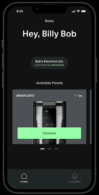
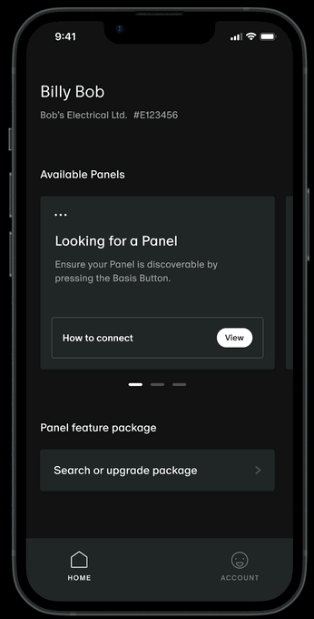
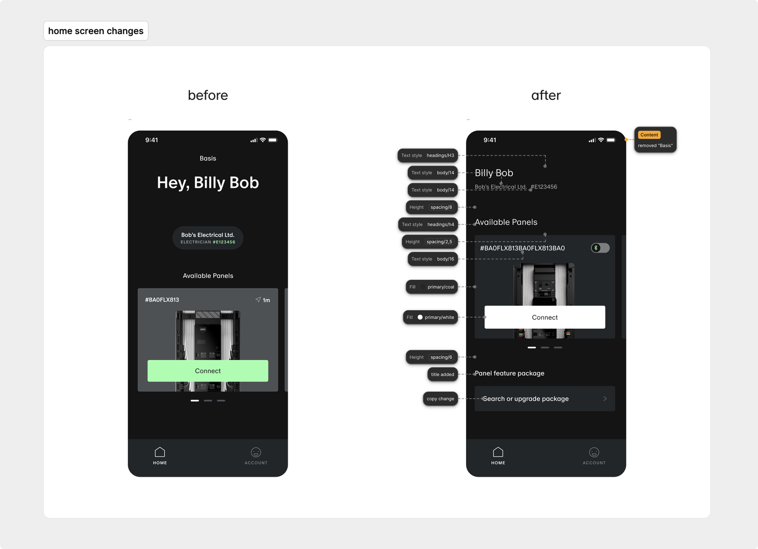
Refocusing the Home Screen
The home screen had a weak visual hierarchy, making it hard for users to focus on their primary job-to-be-done: connecting to and configuring a panel. Important actions were buried or visually indistinct, slowing users down.
Solution
I redesigned the UI with strict layout constraints — all existing features and functionality had to remain unchanged. The improvements focused entirely on visual clarity and task prioritisation:
Reordered cards based on real-world task frequency
Refined spacing, grouping, and headings for scannability
Made targeted copy changes for better clarity and tone (e.g. action-focused labels, simplified descriptions)
Used typographic styling (weight, size, spacing) to establish visual priority without altering tokens
Constraints
Visual-only changes, no functionality or new logic added or removed
All updates had to be deployed without disrupting feature parity

Faster orientation and decision-making on app open
Clearer visual flow and emphasis on primary actions
Increased engagement with key quick actions (as seen in internal metrics)
Impact
Clarity around disabled features
Users were often confused when certain configuration settings appeared disabled with no feedback. This led to guesswork, incorrect assumptions, and delays in completing configurations.
Solution
We introduced a new UX pattern: a contextual overlay modal that appears when users tap a disabled feature. The modal includes clear microcopy (e.g. “Requires Phase Setup” or “Available with Feature Package X”) to explain the restriction. Where applicable, users are prompted to upgrade their feature package, creating a clear path to resolution and opening up new upsell opportunities.
Key Changes
Tapping a disabled feature now triggers a modal explaining the context
Upgrade prompts for features gated behind specific packages
Pattern applied consistently across key UI areas

Impact
Reduced user frustration and guesswork
Boosted clarity and transparency in app interactions
Created new opportunities for upselling through contextual prompts
Increased configuration success rates for sparkies on site
Reflections & impact
By taking a systems-minded, user-first approach, I evolve the Basis Trade experience without requiring a full redesign. Each improvement was small, intentional, and test-driven. Making the product more intuitive, supportive, and resilient in the hands of sparkies.